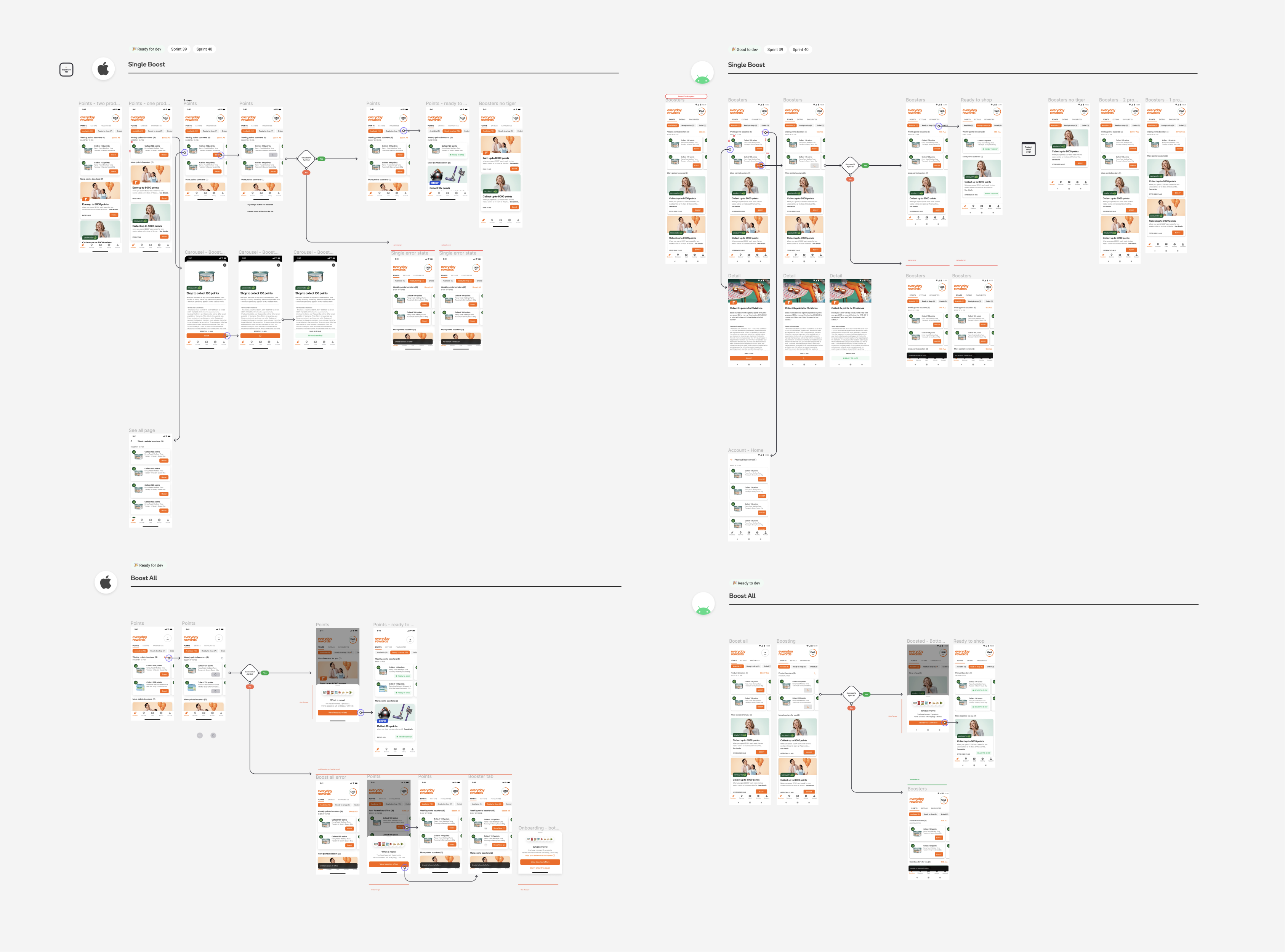
Curated Weekly Offers
A curated personalised offer experience to help customers save expenses on grocery shopping.
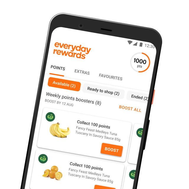
A curated personalised offer experience to help customers save expenses on grocery shopping.
Everyday rewards is the official loyalty program for Woolworths. As one of the biggest loyalty programs in Australia, it provides various offers to customers.
Engaged customers receive weekly product offers in the app based on previous shops. Through those offers, customers will get rewarded by shopping the same products within a period of time.

Led the end-to-end design process
Currently weekly offers are consumed by legacy design, which doesn't fit the business long-term vision.
Design a new offer tile that fits the context and vision of weekly offers.
Scan scan scan... - Not understand how the program works. Just scan the memebrship card during checkout without activating any offers.
Boost boost boost... - They are opportunist and rewards enthusiast. Activate every single offers on sight.
Plan plan plan... - Plan their shop. They are selective on the offers.
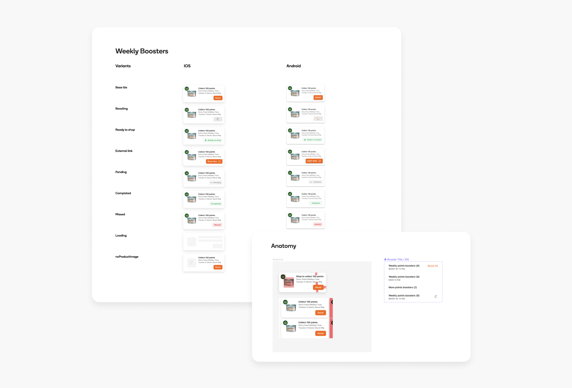
Multiple brands - Business also seeks commercialisation in the near future. The new design needs to cater for a multi-brand weekly offers state.
Key dates - Educate customers on the date to activate as well as the expiry date for each weekly booster
Activation behaviour - The solution is flexible to accommodate multiple user behaviours. They need to have the option to activate either single or multiple boosters.
Multiple offer type - As a brand new offer type, consider how it co-work with other offers without creating an extra cognitive load for customers.
Post activation journey* - As a future state, consider how might we help customers to earn bonus points after activating the weekly offers.
Enhanced personalisation* - As a pain point, address a better-personalised offer experience that drives better engagement
Gives users a more immersive experience when browsing through weekly offers
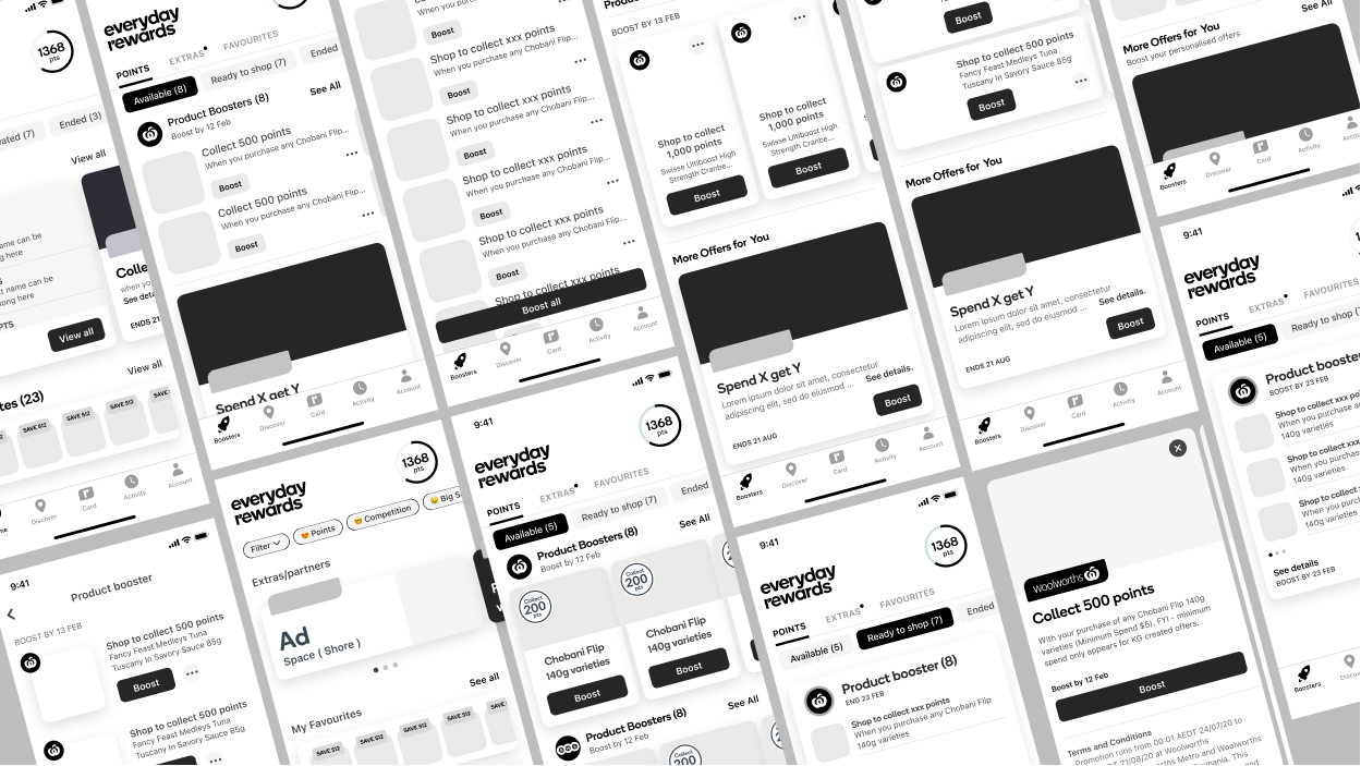
We conducted a user testing session with 6 participants.
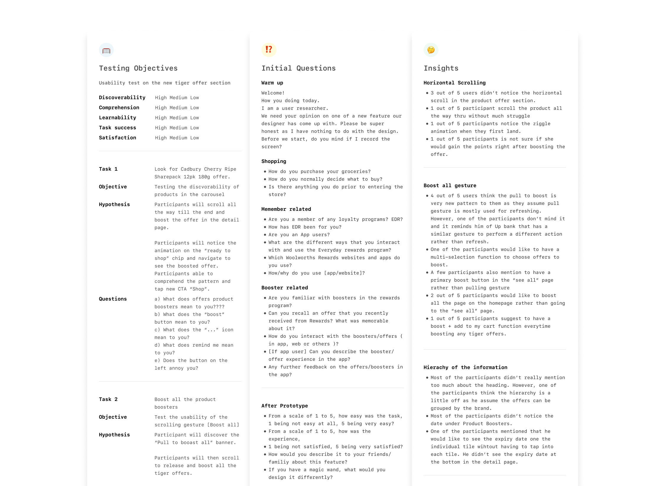
Participants have no issues with the new horizontal scroll view of the weekly booster. However, not everyone notices the horizontal scroll.
4 out of 6 users think the pull to boost is a very new pattern to them as they assume pull gesture is mostly used for refreshing.
Half of the participants would like to boost all the offers on the homepage rather than going to the “see all” page. We revalue the purpose of having to see all pages.
“ Give me the option to boost all on the points tab! ”
" Didn't saw the pull to boost because I was focusing on the scroll, I would make that more visible..."
“Maybe remind me will give me a alert to on day specifically for me to choose”
Based on the key learnings from the testing, we made a few changes:
Engaged users are unlikely to view every single detail of the boosters as they are familiar with the rules
A big portion of them actually activate whatever offers they receive. They even think of activation as a chore.
